Old Plantation Steel Cut Coffee — A Second Simpson & Doeller Tin Enters the Reference Set
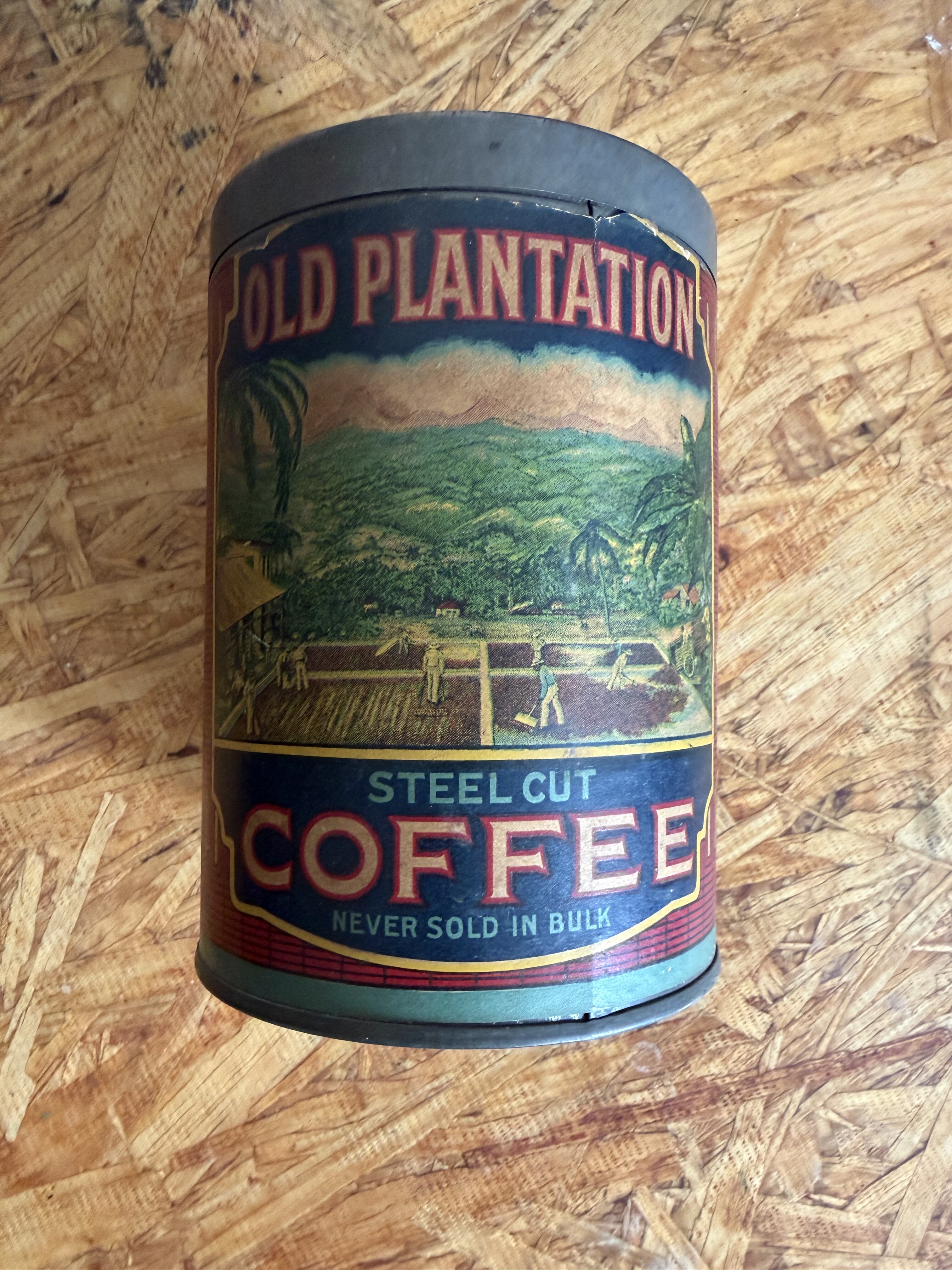
A Baltimore comparandum entered the collection from Maryland seller ryansrelics8100 for $85.52 delivered — a one-pound “Old Plantation” Steel Cut Coffee tin roasted and packed by Merchants Coffee Co. of Baltimore, Maryland. The tin is not H and H merchandise — and the firm on the label is not the San Antonio Merchants Coffee Company that merged with W. R. Hoffmann’s business in February 1912 to form Hoffmann-Hayman. It is a separate, contemporaneous Baltimore firm. The reason it is in the museum collection has nothing to do with that name collision and everything to do with what is printed along the bottom seam of the back panel.
The Simpson & Doeller mark on the seam
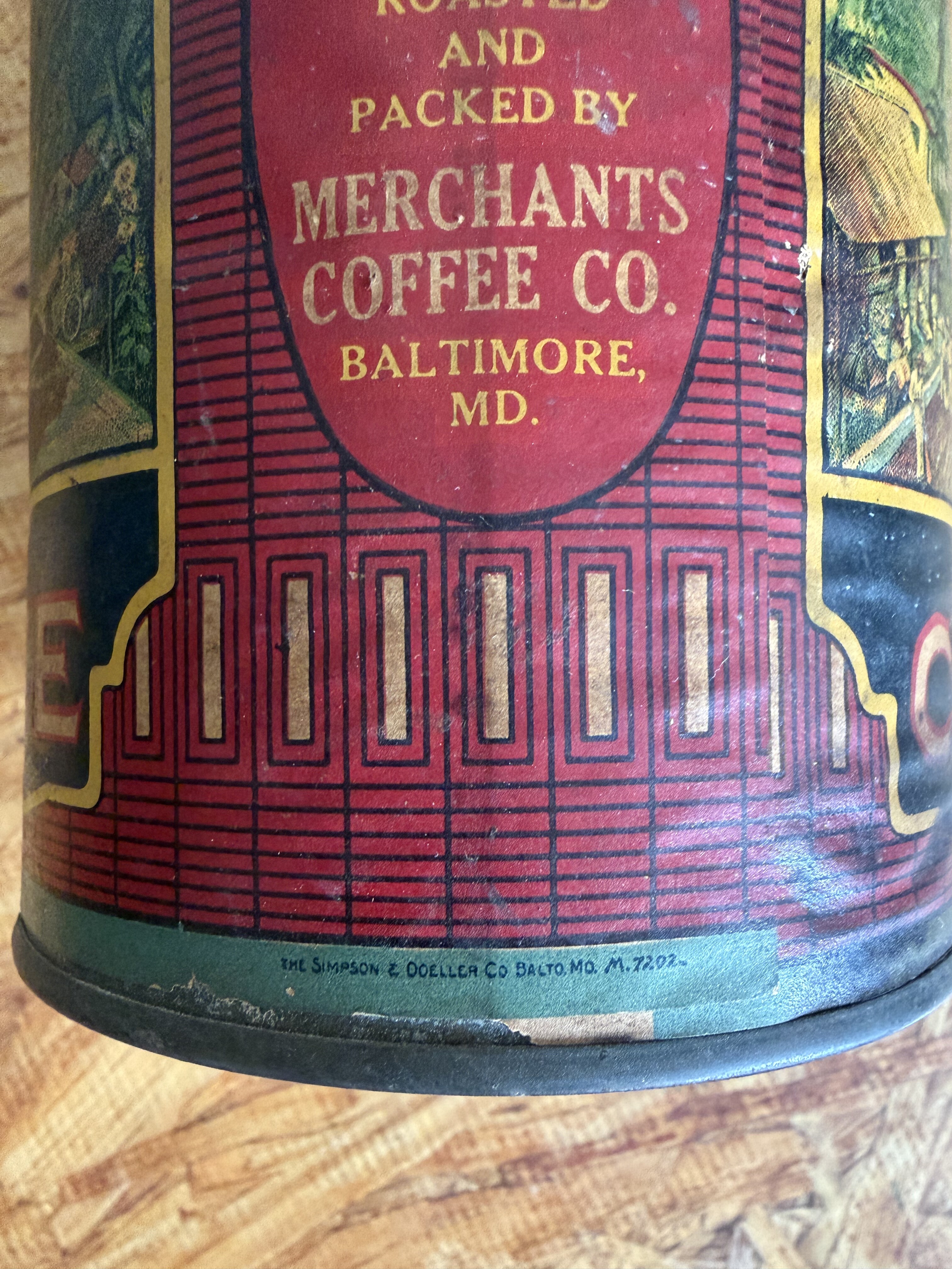
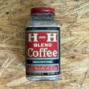
The fine gold capitals on the lower seam read “THE SIMPSON & DOELLER CO BALTO MD M 7202” — the same Baltimore label-art / tin-decoration house already documented on the 1920s H and H Blend tin in the collection, where the same maker-mark formula appears as “THE SIMPSON & DOELLER CO BALTO MD H 7080 11”. The differing trailing codes — H 7080 11 on the H and H Blend tin, M 7202 on this Old Plantation tin — almost certainly index Simpson & Doeller’s internal job ledger (client / series / sequence). Until this tin came in, Simpson & Doeller was attested in the wiki on a single client commission. This Old Plantation tin widens the evidence base: the firm worked across the regional coffee trade, producing labelwork for at least two distinct clients — H and H in San Antonio and Merchants Coffee in Baltimore — and they almost certainly served more than that.
Same printer’s hand — two brand briefs
The two tins read as variants on the same printing-house “house style” rather than two unrelated commissions:
| Element | H and H Blend tin (HH-REF-0000-0117) | Old Plantation tin (this entry) |
|---|---|---|
| Maker mark | “THE SIMPSON & DOELLER CO BALTO MD H 7080 11” | “THE SIMPSON & DOELLER CO BALTO MD M 7202” |
| Mark placement | Lower seam, fine gold caps, no surrounding ornament | Lower seam, fine gold caps, no surrounding ornament |
| Cartouche framing | Gold-edged medallion on navy ground | Gold-edged oval medallion on red ground |
| Ground | Deep navy / black | Red dominant, navy accents |
| Accent palette | Gold + red horizontal stripe + green / teal | Gold + green / blue vignette + red horizontal stripe |
| Border construction | Layered (gold keyline + colored band + ornamental rule) | Layered (gold keyline + colored band + ornamental rule) |
| Pictorial content | None — geometric / typographic | Full-color plantation-scene chromolithograph vignette |
What the printer shares across the two jobs:
- The maker’s-mark convention (gold caps along the lower seam, no ornament, with a short alphanumeric job code).
- The gold-edged cartouche grammar for brand identity.
- A disciplined gold-on-saturated-ground palette with the red horizontal accent band as a recurring device.
- Layered border construction building three or four concentric rules around the content area.
- Confident chromolithographic register and gold-ink technique consistent with late-19th- / early-20th-century Baltimore trade lithography.
Where the briefs diverge is interpretive, not technical:
- H and H Blend wanted dignified typographic restraint — rectangular gold-edged panels, abstract Victorian framing, no pictorial vignette.
- Old Plantation wanted romantic scene-setting — a full-color plantation vignette of palm trees, harvest field, and distant hills dominates the front face, with “STEEL CUT COFFEE — Never Sold In Bulk” reading as the strapline beneath.
The same printer, the same time period, the same Baltimore label trade — two different commercial postures.
Why the comparandum is in the museum
The Old Plantation tin is not displayed as a Merchants-Coffee-Baltimore artifact in its own right — the museum thesis is H and H, not 20th-century Baltimore coffee. It is held as comparative documentation of Simpson & Doeller’s output, exactly the same way the Joy-Cup Brand tin (also Baltimore-area) is kept as packaging context, the Three Rivers waffle-pattern square quart jar ([HH-PACKAGING-2018-0002](/accessions/#hh-packaging-2018-0002)) is kept as a Three Rivers Glass comparandum, and the Sam Houston one-pound tin anchors the Sam Houston portrait-and-wreath idiom. Each comparandum sharpens the read on the H and H artifact it sits beside.
For this tin, the read it sharpens is on how Simpson & Doeller worked — a Baltimore label-art house with a consistent gold-and-saturated-ground aesthetic, a numbered job-code ledger, and a client roster that crossed regional coffee markets. The presence of both an H and H tin and a Merchants Coffee tin from the same printer turns a single H and H label-art datum into the beginning of an evidence base.
Accession and references
- Accession: HH-CAN-2026-0008
- Gallery artifact: HH-OTH-2026-0001 (in the not our H and H comparandum gallery)
- Simpson & Doeller wiki page: companies/simpson-and-doeller
- The Baltimore Merchants Coffee Co. (this tin) is not the SA Merchants Coffee Co. that became H&H — see companies/merchants-coffee-company for the SA firm’s pre-1912 trajectory.
- Receipt:
knowledge-base/raw-archives/records/ebay-orders/2026/2026-05-18-06-14660-24384-ryansrelics8100.pdf(order 06-14660-24384, delivered 2026-05-23).