A Two-Pound Master Chef Pair Bracketing Two Label Generations
A two-tin lot of Master Chef keywind cans came in from California via eBay seller lovebug0101 — both 2 LBS NET, both Regular grind, both photographed on the same OSB (oriented-strand board) workshop benchtop used for the recent H and H High Grade three-pound second example and the keywind second example, giving consistent in-hand documentation across the recent acquisitions.
The small surprise was that once both tins were photographed they turn out to be from two different label generations — what looked like a duplicate pair from the listing thumbnail is actually a bracketed pair of consecutive Master Chef liveries at the 2-lb size.
Why the two-pound matters
The Master Chef line is overwhelmingly a one-pound brand in the collection — keywind one-pounds dominate the items guide’s size table, with the only previously documented two-pound being the 2018 SA-listing tin (HH-CAN-2018-0001), which is still in the queue for imaging. This lovebug0101 lot is therefore the first photographed two-pound of the brand in the museum’s documentation, and it provides a second (HH-CAN-2026-0007) at the same stroke — but, instead of duplicating one variant, the two specimens bracket two consecutive label generations of the brand at the 2-lb size, which is the more useful curatorial outcome.
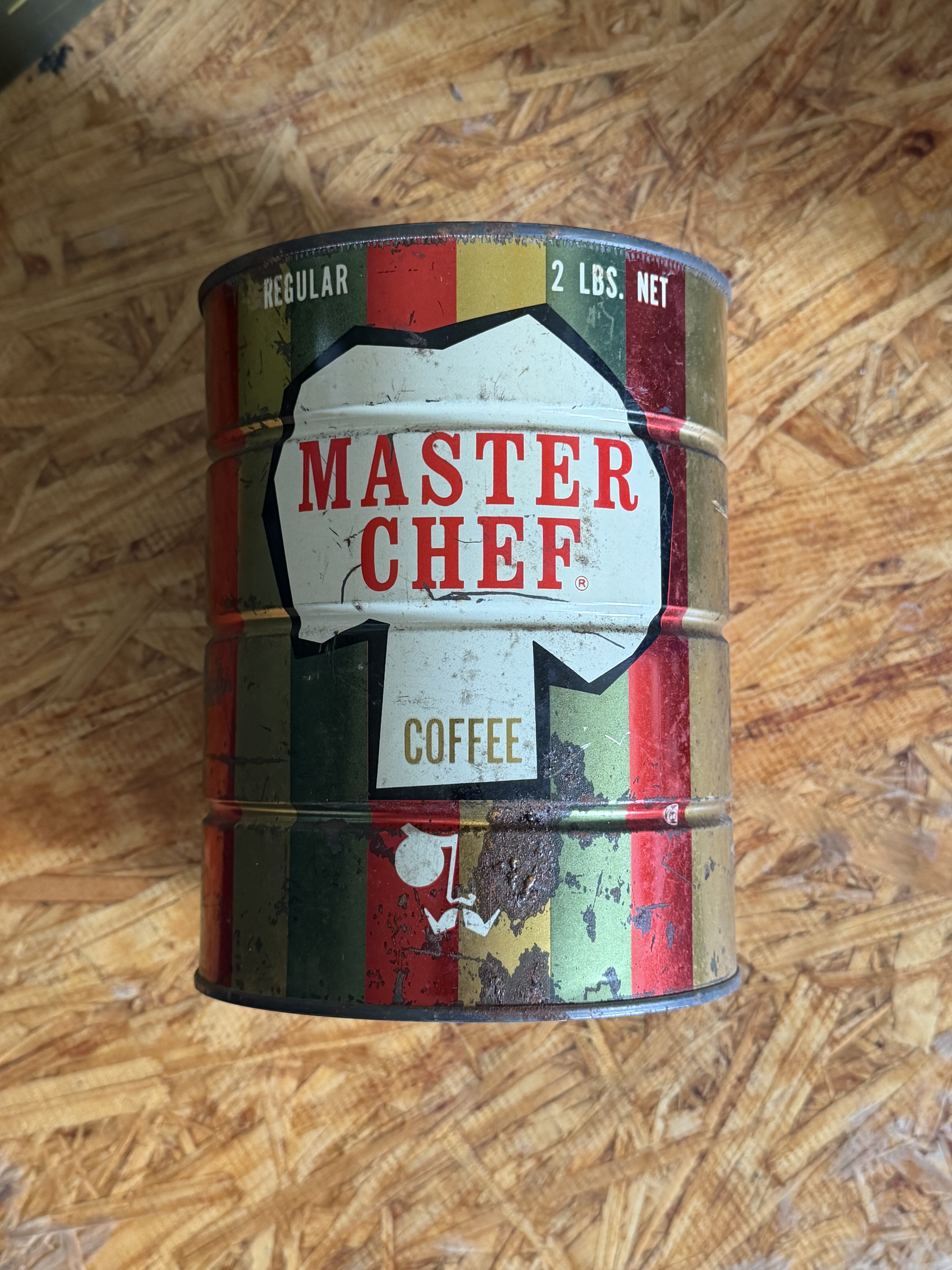
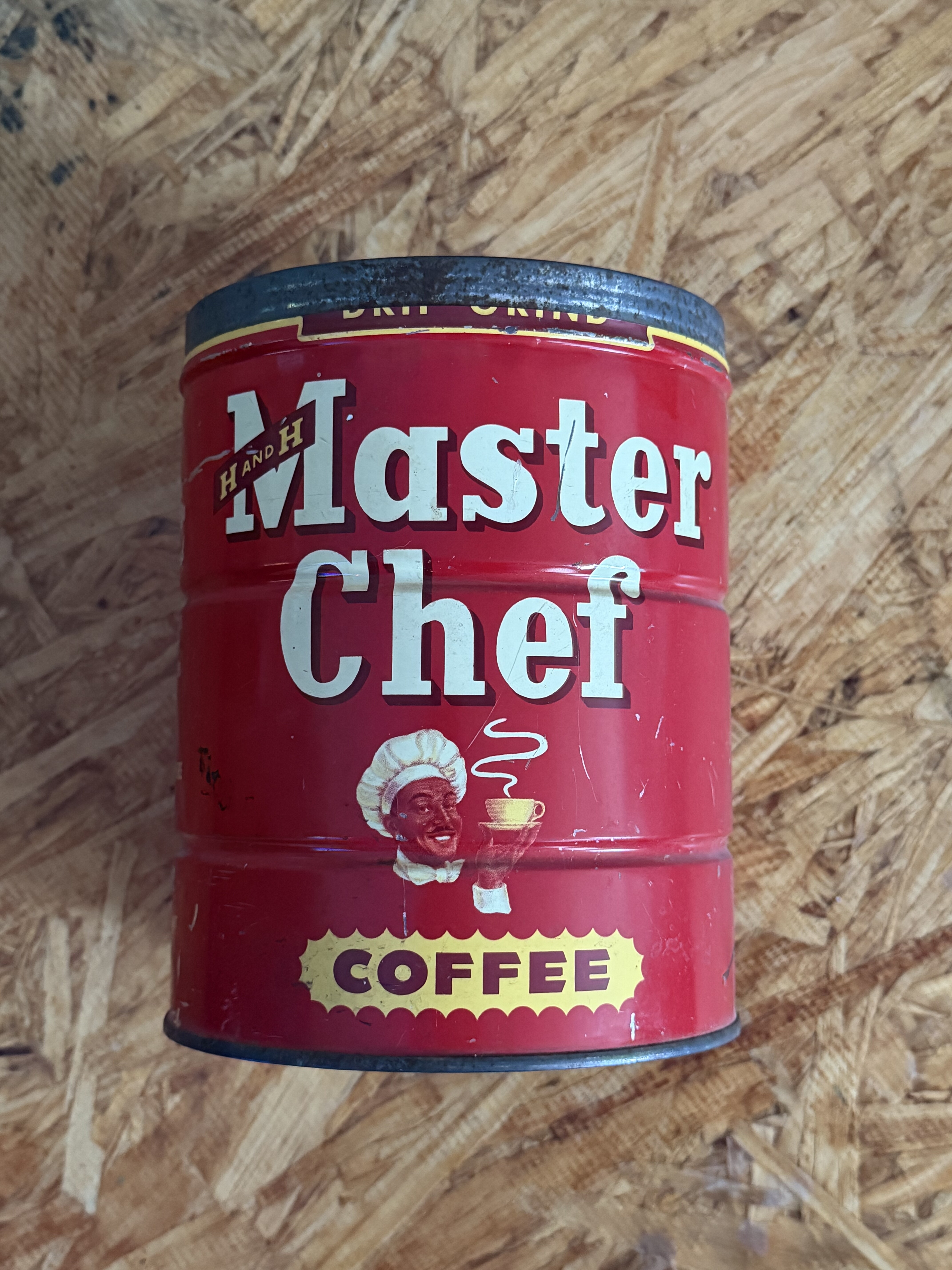
Tin #1 — mid-century redesign (c.1962+)
Front face, top to bottom:
- Bright red field dominating the wraparound litho, with the chef’s-toque mascot in white set within an octagonal medallion left of center and the MASTER CHEF wordmark in tall red serif capitals running across the white-on-red field.
- “COFFEE” in white serif block on a dark inset panel beside the mascot.
- “REGULAR” grind callout on a narrow side panel and “2 LBS. NET” on the opposing flank — both lockup elements consistent with the c.1962+ Master Chef redesign.
- H AND H diamond lockup small at the lower edge — the brand affiliation present but visually subordinated to the Master Chef wordmark, the same hierarchy the 1962 Express “Dean of Coffee Roasters” Master Chef spread was deploying in print at exactly this period.
- Keywind strip running around the upper body.
Tin #2 — earlier white-script livery (classic keywind era, c.1935–1957)
Front face, top to bottom:
- Red field, but with the brand identity carried by a very different graphic language than tin #1.
- “Master Chef” rendered in white italic / script lettering — flowing decorative letterforms rather than tin #1’s geometric block serif.
- Chef-portrait roundel to the right of the wordmark — a small circular medallion containing a chef mascot, rather than the white-toque-in-octagon mark of the 1962+ redesign.
- Yellow oval “COFFEE” badge on the right shoulder of the front face — a separate cartouche treatment for the product line, where tin #1 set “COFFEE” as plain type on a dark inset panel.
- H AND H diamond lockup at the lower left — present at the same scale as tin #1, marking continuity of the brand mark across the redesign even when everything else around it changed.
Per the Master Chef tin guide, the script lettering + portrait-roundel + oval-COFFEE-badge combination places this in the classic keywind era (c.1935–1957) — the design that ran between the “Cafe Coffee” era (1932) and the mid-century redesign (c.1957+) that tin #1 represents.
What the pair adds to the documentation
Holding the two side by side gives the first documented case in the collection of:
- A side-by-side label-generation comparison at the 2-lb size — every other documented Master Chef era jump in the collection has been across one-pound tins.
- Continuity of the H AND H diamond across the redesign — the brand mark stays at the same position and scale even as the chef art, the wordmark style, and the COFFEE treatment all change.
- Stability of the keywind format itself — both tins are 2-lb keywinds, so the format outlasts the labelwork.
The era-comparison thread will keep developing as more Master Chef tins are dated and re-photographed — tracked as TODO-23 (“Master Chef label-design comparison across artifacts + newspaper clippings”) in work/TODO.md.
Accessions
- Tin #1 (mid-century redesign): HH-CAN-2026-0006 — gallery artifact HH-COLL-2026-0005
- Tin #2 (white-script classic keywind): HH-CAN-2026-0007 — gallery artifact HH-COLL-2026-0006
Receipt: knowledge-base/raw-archives/records/ebay-orders/2026/2026-05-20-10-14664-15537-lovebug0101.pdf (order 10-14664-15537, delivered 2026-05-22).