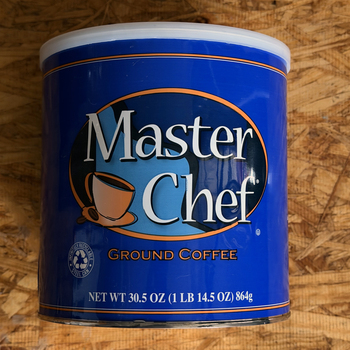
S. P. Stevens and the H and H Master Chef sign — visual comparison
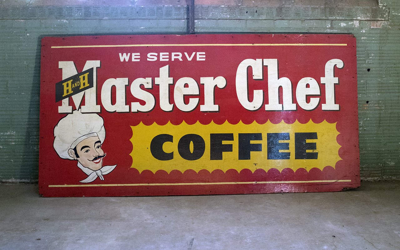
Family lore says S. P. Stevens — Stanford P. Stevens — got his start painting H and H Coffee billboards, then went on to own Stevens Outdoor Advertising in San Antonio. He was also remembered as a collector of guns, Americana, and cars. We can’t confirm the attribution directly — no signature survives on the sign back, and no Stevens Outdoor city-directory listing has been sourced yet. But two signed personal paintings give us the clearest picture we have of his hand.
The 1954 cowboy — eyes and moustache
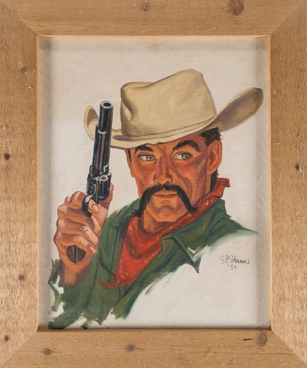
Signed and dated S.P.Stevens ‘54 in the lower right. The face is the comparison piece: heavy dark brows, green-grey eyes with modeled irises and direct frontal gaze, and a thick downturned handlebar moustache in flat black. The moustache is the same architectural element — a wide, symmetrical droop flanking the nose and mouth — that the Master Chef sign’s chef wears at counter-reading distance. At easel scale Stevens renders it with individual hair texture; at 4×8 sign scale the same shape reads as a flat black silhouette. Expected difference for a working sign-painter.
The 1958 woman in red
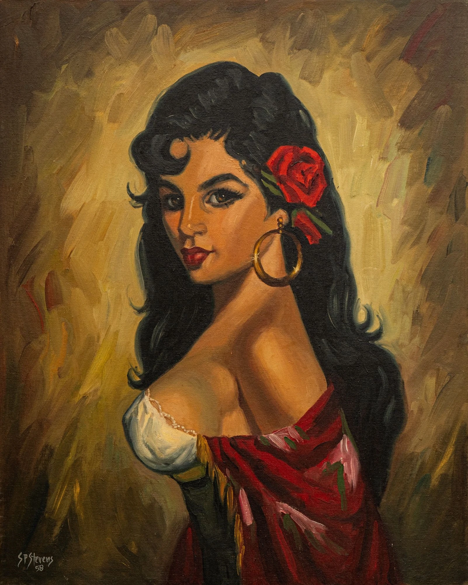
Signed S.P.Stevens ‘58. A three-quarter-view portrait: black hair with a red rose, gold hoop earrings, off-shoulder red dress. The warm earth-tone impasto background, the confident line in the hair, and the bold flat reds are consistent with the same hand that handled the cowboy’s bandana and hat. This is the later of the two confirmed samples.
The comparison case
The Master Chef sign’s chef shares enough with the 1954 cowboy to make the attribution a live research lead:
- Same 3/4 head orientation, gaze pulled slightly forward
- Same heavy brow treatment (flat-silhouette on the sign, modeled at easel scale)
- Same thick handlebar moustache structure — the dominant facial element in both
- Both figures cropped at mid-chest, hat cutting the top of the frame
The surface-treatment differences (flat sign paint vs. modeled oils) are scale-appropriate, not evidence of different hands. A 4×8 sign read at 15 feet and an easel portrait viewed at 3 feet should look different even if painted by the same person.
What the comparison cannot do: the easel portraits are personal art, not commercial sign work. The discriminating test is like-to-like — the Master Chef sign against other documented Stevens Outdoor Advertising commercial-scale work. That comparison requires sourcing Stevens Outdoor billboard examples first, which remains the top research target.
What still needs proof
- A Stevens Outdoor Advertising entry in any San Antonio city directory (c.1935–1965)
- An obituary, profile, or interview naming Stanford P. Stevens
- A painter’s signature, stamp, or contractor attribution on the back of the Master Chef sign or any other H&H commercial sign
- Stevens Outdoor commercial sign examples for a scale-matched visual comparison
See the S. P. Stevens KB page for full hypothesis analysis and wanted-list.