H and H Coffee wing-banner with oval tin crop — Express-News, 21 Jan 1925
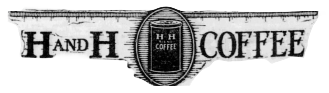
A wide horizontal banner lifted from the “Romance of Coffee” ad. Two ragged-edge wing panels flank a central oval medallion: the left wing reads “H AND H” in heavy slab-serif display caps, the right wing reads “COFFEE” in the matching face. The oval medallion at center frames a small line illustration of an H H Coffee tin — a tall round can with the “H H / COFFEE” label reversed on the wrap. The top edge of each wing is finished with vertical pinstripe shading.
For Hoffmann-Hayman brand history this banner is a useful logotype lockup variant: rather than stacking the wordmark vertically as the 1919 Express ad does, this 1925 treatment spreads “H AND H” and “COFFEE” horizontally on either side of a medallion-framed tin — a layout that reads more like a brand crest than a column heading. It documents how the H and H mark was being dressed up for the “Romance of Coffee” feature ads of the mid-1920s.
Transcription
H AND H · COFFEE
H H
COFFEE
Source
- See Romance of Coffee — San Antonio Evening Express, 21 Jan 1925 for full context and transcription.