H AND H BLEND COFFEE display panel crop — San Antonio Express, 24 May 1919
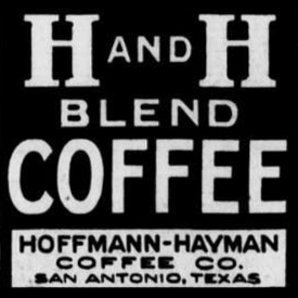
A square reverse-out display panel lifted from the M.I.S.A. Show closing-night ad: massive slab-serif type stacks “H AND H / BLEND / COFFEE” white on solid black, with a small reverse cartouche at the foot reading “HOFFMANN-HAYMAN / COFFEE CO. / SAN ANTONIO, TEXAS.” The frame is square and entirely typographic — no product art, no rule lines beyond the black field itself.
For Hoffmann-Hayman brand history this is the cleanest 1919-era logotype lockup in the project archive: it shows the all-caps “H AND H BLEND COFFEE” wordmark with the company slug set as a stacked three-line legend rather than the curved or scripted forms that emerge in the mid-1920s. The plate is well-inked enough to serve as a typographic reference for early-postwar H and H house style before the round-tin can illustrations take over the ad layouts.
Transcription
H AND H
BLEND
COFFEEHOFFMANN-HAYMAN
COFFEE CO.
SAN ANTONIO, TEXAS
Source
- See H and H Blend — M.I.S.A. Show final night, San Antonio Express, 24 May 1919 for full context and transcription.